As an art director and curator, I dedicate significant time to creating visuals with depth and purpose, thoughtfully aligning each concept with brand strategy. Clients turn to me when their brands need something beyond just aesthetics — they seek meaningful narratives translated into visually compelling stories that resonate deeply with their audience. This can range from crafting brand DNA and discovering core brand values, to designing impactful advertising campaigns or curating unique collaborations with the art world.
I genuinely believe every project, whether an ambitious campaign or a seemingly simple collection shoot, must carry a concept that sparks curiosity and excitement. Of course, at the end of the day, it's all about commercial results. Yet, ironically, it is exactly these carefully developed concepts — whether referencing artistic masterpieces, historical narratives, or current social dialogues — that create true emotional impact, leaving lasting impressions in the hearts and minds of consumers.
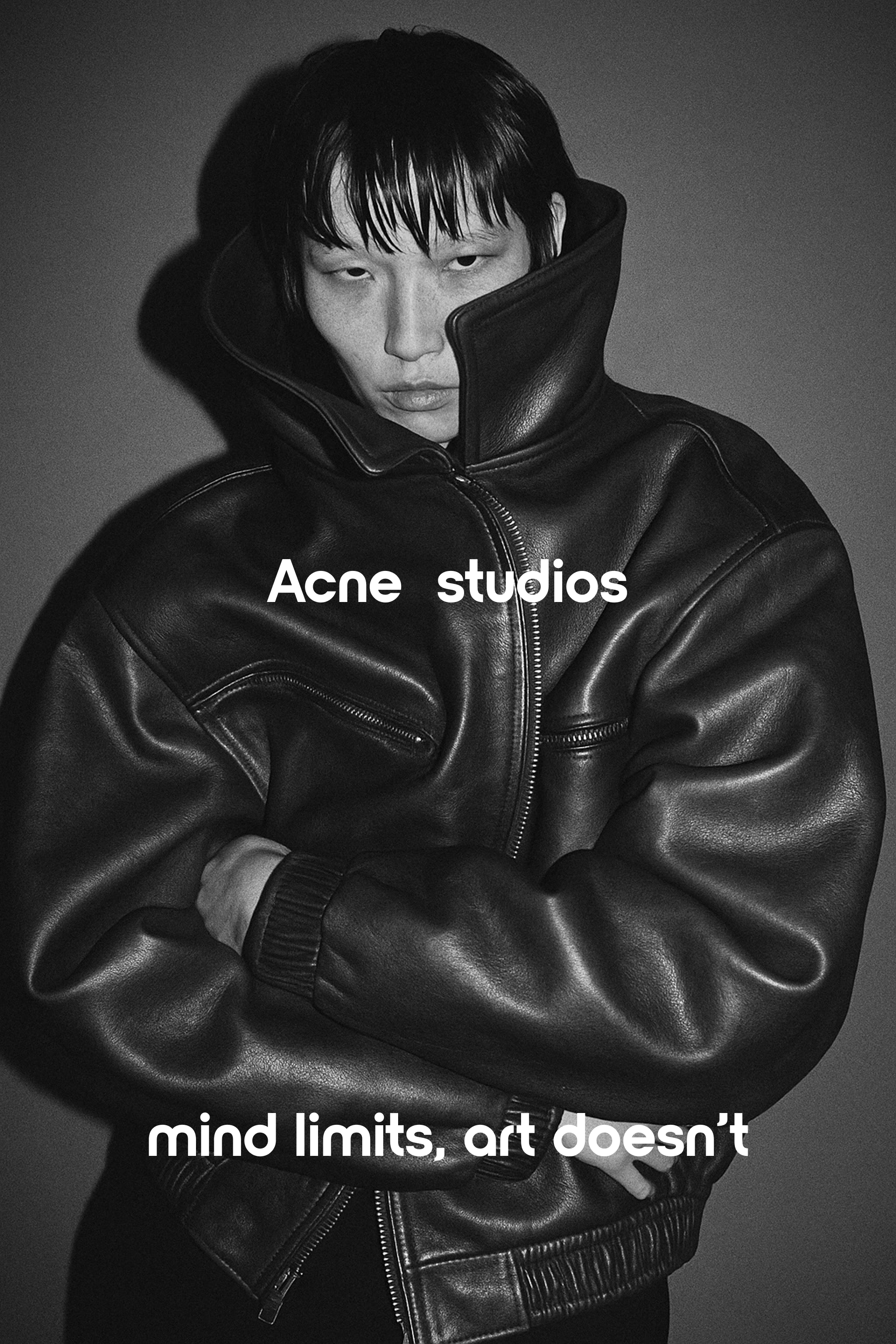
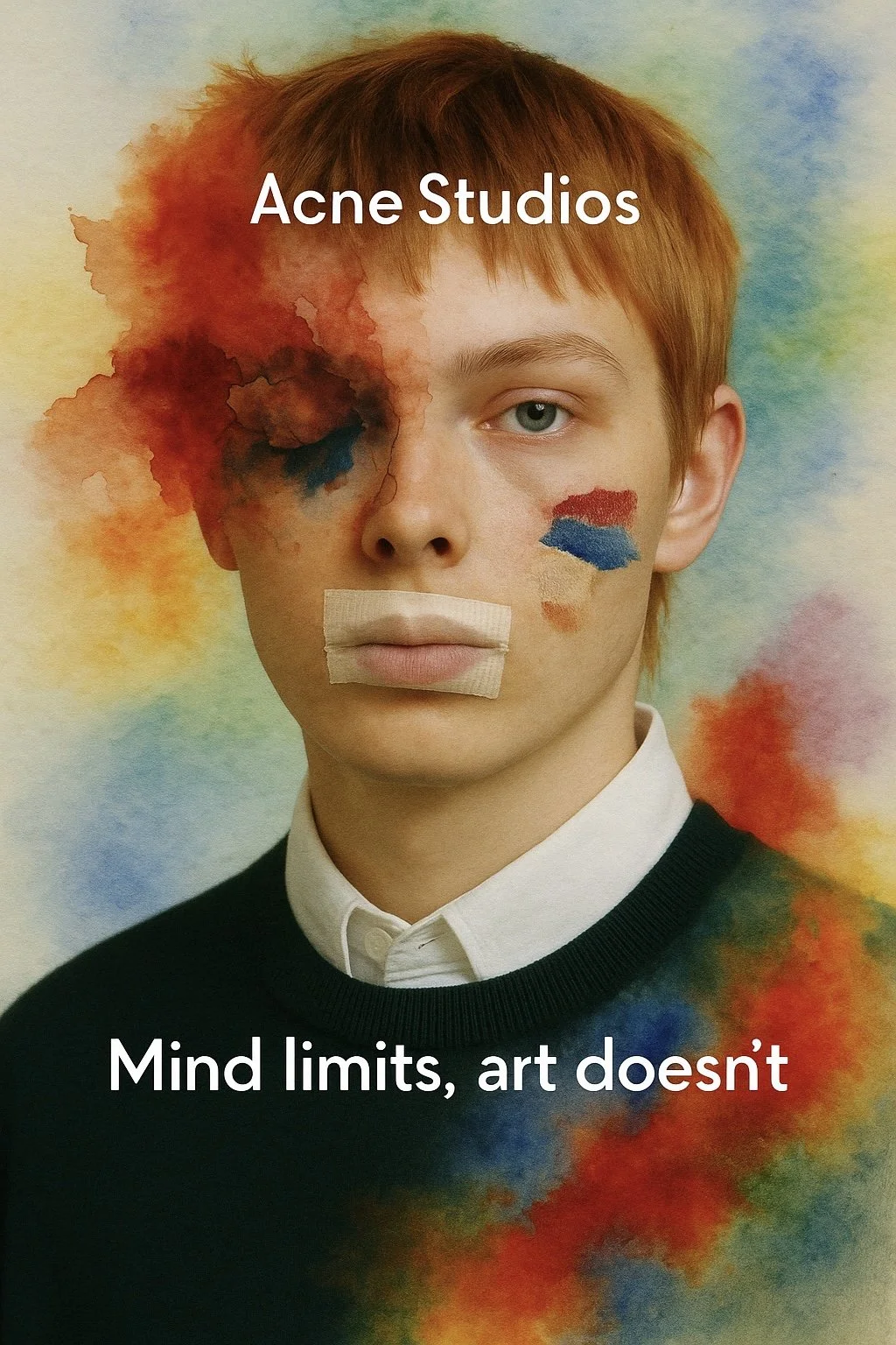
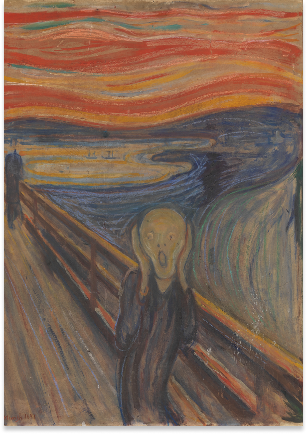
01 — “Mind Limits, Art Doesn’t”
This project was born from a question I kept circling back to: how often do young artists hide — from the world, from themselves, behind their work? There’s a quiet but painful insight behind it — many young creatives still struggle to adapt to societal expectations, often because they don’t quite fit. And maybe they shouldn’t. The problem isn’t that they’re different — it’s the illusion that they need to fit into frames that only exist in their own minds.
Inspired by Acne Studios’ ongoing support of artistic communities, I wanted to create something that wasn’t just visually striking, but emotionally precise.
The core message — Mind limits, art doesn’t — became both a provocation and a permission slip. We crafted a visual language where the boundaries between subject and medium collapse: faces dissolve into watercolor, expressions blur into abstraction, and even objects — like the teddy bear — become symbols of identity restrained, taped into stillness.
I spent a lot of time thinking about the emotional duality in the works of Viktor Vasnetsov — the dreamlike melancholy, the way softness and depth coexist in his color palette and brushwork. His sense of quiet narrative tension found its way into the watercolor distortions and tonal choices in the series.
From art direction to concept development, the campaign was built to reflect the very real emotional paradox of self-expression — the desire to be seen and the instinct to hide. And in a commercial context, that tension becomes electric — because we’re not just talking about creativity, we’re also talking about the emotional triggers that drive real-world purchase decisions.
The idea holds potential far beyond this series — as a foundation for future collaborations with emerging artists, inviting them to speak boldly through Acne’s platform and positioning the brand as a cultural amplifier, not just a fashion label.


02 — “Echo of Eternity”


The idea that statues — frozen in time, stripped of their voice — might one day speak again. I wanted to explore how fashion could serve as that voice. How garments, textures, and expressions could breathe life back into something ancient, something cold.
In the Loewe series, we mirrored modern faces with classical sculpture — not to imitate, but to confront. The living and the lifeless, side by side, with barely a difference. In Jil Sander’s frame, motion blurred through marble halls, echoing ghosts of identity and legacy. And for Margiela, we turned to the hand — disembodied, yet in full control — holding a bag like an artifact torn from a modern myth.
The concept played with reversals: time flowing backward, stone softening, expression being reinserted where silence once reigned. It was less about “bringing history to life” and more about allowing fashion to acknowledge its ancestors — statues as metaphors, as mirrors, as reminders.


From art direction to visual narrative, every image was meant to feel like a moment stretched across centuries. Aesthetic alone wasn’t the goal — it was the emotional residue that mattered. The weight of something you’ve seen before but never really felt.
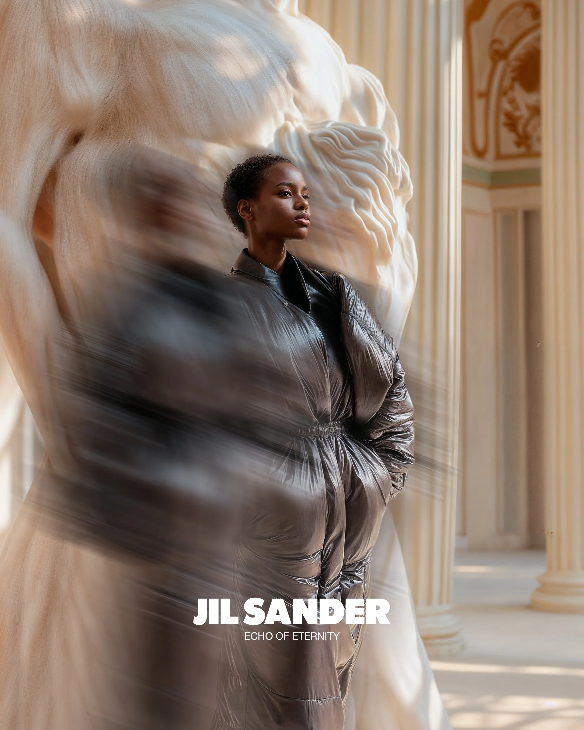
The initial spark came from the myth of Pygmalion — the sculptor who fell in love with his own creation, until it came to life. That tension between admiration and projection, between the object and the soul, became the philosophical backbone of the entire concept. Fashion, too, carries that kind of obsession. In a way, every garment is a modern sculpture waiting to speak.
The campaign featured three distinct brands — Loewe, Jil Sander, and Maison Margiela — each reinterpreted through the lens of eternal presence. Not seasonal relevance, but presence.
This project started with a simple idea — I wanted to create a space where creativity and art could exist outside of algorithms, pressure, and the constant need to "produce." At the very beginning, it was just a thought: how can I help people make sense of what they see? How do we learn to analyze art, campaigns, and visual codes in a world overloaded with content? That’s how FCKNCREATIVE was born.
03 — “FCKNCREATIVE: Art, Strategy, and All That Weird Stuff In Between”

But over time, it evolved into something more: a living, interactive journal where research, visuals, thoughts, and unfinished ideas could exist together.
I curate everything from references and narrative flow to the visual identity and tone. It’s important for me that this journal doesn’t feel like content for content’s sake. It’s a slow space. A place to think, to feel, to connect. Where AI-generated work stands next to classical references, where a sentence from an old book becomes a concept for a new campaign.
FCKNCREATIVE helps me explore the in-between: between strategy and intuition, beauty and meaning, research and emotion. It’s not about perfect answers — it’s about learning to notice more.

At first, I imagined it as a platform to support young artists
— a place for collaboration, reflection, and raw, honest experimentation.


04 — “Memoringe: A Jewelry Poem” Art direction, strategy & curation
What if the founder of a jewelry brand is, at heart, a poet?
That was the starting point. The task wasn’t just to merge two art forms — it was to create a space where visual, textual, and emotional storytelling could exist in harmony. A place where jewelry becomes language, and every image feels like a verse.
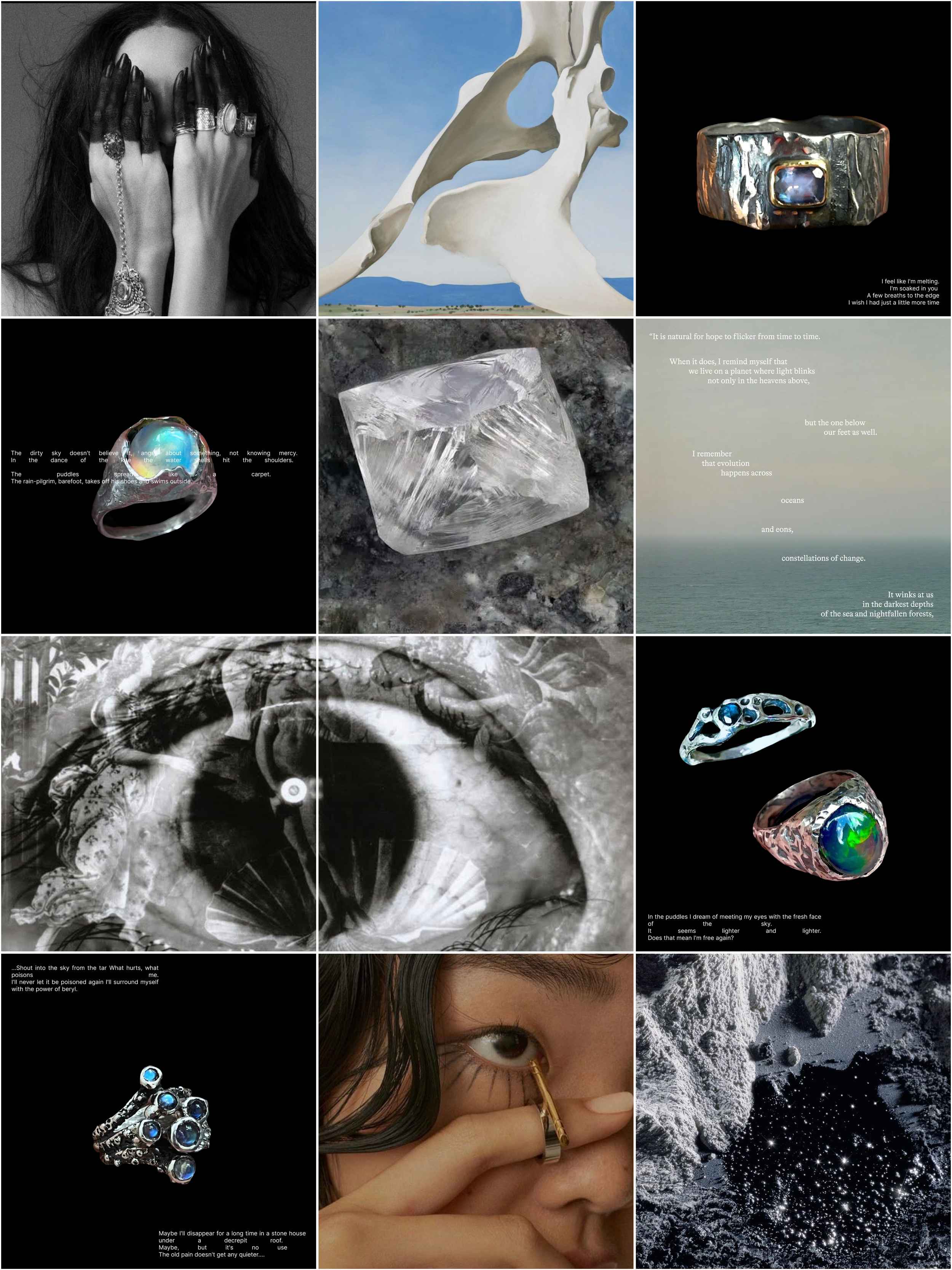

The art direction was guided by one key principle: intimacy over perfection. We built a visual language that felt quiet, gallery-like, emotional. Soft textures, earthy tones, and frames that give space for the object — not to sell, but to be seen. I wanted every visual to feel like a pause, a breath, a small piece of someone's internal world.
Strategically, we redefined the brand using a 4D approach — functional, social, emotional, and spiritual dimensions. Every piece of content — from a story about a stone to a quote on a reel — aligns with this deeper framework. The product is never just shown, it’s introduced: where it comes from, why it was created, and how it transforms the person who wears it.
At its core, Memoringe is not for everyone — and that’s the point. It’s a brand for people who notice details. People with aesthetic intelligence. People who turn their taste into a form of identity.

This project became a space for reflection — on beauty, meaning, and how we perceive value. From the very beginning, I didn’t see Memoringe as a jewelry brand. I saw it as a way to reframe what luxury can look and feel like in a digital world.


We introduced interactive layers to expand the narrative: — AI-generated visuals to imagine future collections and surreal worlds around the pieces
— poetic storytelling through quotes, fragments, and textures
— community-driven content that brings in artists, creators, and thoughtful influencers
The poetic element is essential to the brand’s voice. Rare stones become verses in themselves — each one a metaphor, a moment, a spark. The way they’re presented in visuals, described in captions, and contextualized in stories mirrors how poetry works: layered, suggestive, emotionally charged.
Memoringe became a digital museum disguised as a brand page — a place where beauty isn't sold, it's shared.
For me, AI is a tool — powerful, but neutral. It’s not a muse, it doesn’t create meaning on its own.
What matters is the vision behind it, the editing, the narrative frame. This ongoing body of work explores how machine-generated visuals can become vessels for storytelling, atmosphere, and visual worldbuilding.

05 — “AI as a Tool: Curated Fantasies” Creative direction, visual research & AI curation
These are not random generations. Each one begins with a curated moodboard, a specific emotional tone, and a clear narrative frame. I work through dozens of variations, adjusting details until they carry a sense of narrative tension.
The goal isn’t to make AI art — it’s to use AI to build visual metaphors with intention.
The goal wasn’t realism — it was resonance. To build images that aren’t about perfection but about feeling. Images that suggest stories before they’re told.
More and more, I see potential in turning this into a broader curatorial project — a visual study in progress. A space where fashion, architecture, and memory overlap through AI-generated aesthetics. Not just as standalone artworks, but as tools to provoke new directions for campaigns, brand concepts, or collaborations.
AI doesn’t replace intuition — it responds to it. And that response is only as strong as the creative direction behind it.
Here are some examples of AI works I curated:
Project: Listen to me
Type: Art Direction & Concept Development
Capsule: Urban Fragrance Series
Creative Direction: Katherine Dorro
Date: October 2024
06 - “Building Meaning”

Visual language references:
Blurred motion - urban tension, the impossibility of focus
Cropped faces, emphasis on ears, necks, shoulders - tactile memory, sensory intimacy


Art direction, for me, always starts with a question — not just about how something should look, but about what it should make you feel. Behind every campaign, every shoot, every frame, there’s a system of references and rhythms that builds the emotional logic of the image. Because a strong image doesn’t come from aesthetics alone — it comes from a story that knows what it wants to say, before it even begins.


This is not a complete art direction delivery. The materials shown represent only the core idea and some of the visual references.
Project: Absorbed
Type: Art Direction & AI Visual Concept
Client: Le Labo (Unofficial)
Date: April`25
07 - Absorbed
This AI-generated editorial explores the idea of scent not as something applied — but something absorbed. The concept centers on the fusion between skin and aroma: when a fragrance stops being external and becomes a part of you. The image is no longer about "wearing" perfume — it's about embodying it. Letting it live on the surface, under the skin, around the presence.
Each composition reflects a specific Le Labo scent: Matcha 26, Santal 33, Lys 41, and Oud 27. Visualized as quiet extensions of the self. Through raw textures, soft light, and grounded expression, the line between the body and the fragrance begins to blur.
The perfume is not the focal point. The person is.
And the scent — it becomes a trace. A language. A second skin.

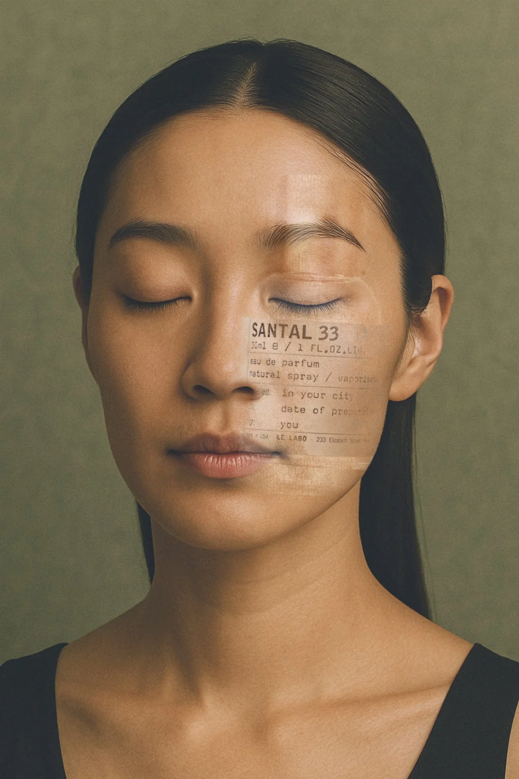


This project is an homage to how fragrance can be felt rather than seen. Lived rather than worn.